멀티캠퍼스2주차-4/ Metplotlib, Seaborn시각화의 기본
2024. 1. 5. 17:57ㆍData Science/Study 자료
import pandas as pd
import matplotlib as mpl
import seaborn as sns
import matplotlib.pyplot as plt
data1 = [10, 14, 19, 20, 25]
#plt.plot(data1)
fig, ax = plt.subplots()
ax.plot(data1)
plt.show()
#객체지향 방식plt.plot()과 같은 방법으로 그래프를 그리는것이 가능하지만,
그래프를 보기좋게 수정하는 과정을 이해하기위해서 객체지향 방식으로 그리는 습관을 들이는게 좋습니다.
수업을 들으며 내가 내린 데이터 분석과 시각화의 요점
데이터 분석과 시각화
- 메세지 전달이 중요
- 복잡한 시각화는 중요하지 않음
- 데이터 분석과 시각화 분석의 조합 #어느한곳에 취중되면 안됨
- 데이터 시각화의 원리
- 삭제 분리 강조 배열
- 대화형 차트 독학으로 태블로 공부하면됨
- matplotlib, seaborn으로 공부
나는 개발보다는 분석위주의 공부를 하기에 plotly는 필요하다면 나중에 알아보기로 결정했다.
선그래프
dates = [
    '2021-01-01', '2021-01-02', '2021-01-03', '2021-01-04', '2021-01-05',
    '2021-01-06', '2021-01-07', '2021-01-08', '2021-01-09', '2021-01-10'
]
min_temperature = [20.7, 17.9, 18.8, 14.6, 15.8, 15.8, 15.8, 17.4, 21.8, 20.0]
max_temperature = [34.7, 28.9, 31.8, 25.6, 28.8, 21.8, 22.8, 28.4, 30.8, 32.0]
선그래프를 그리기 위한 데이터를 임의로 만들어 주었습니다.
fig, ax = plt.subplots(nrows = 1, ncols = 1, figsize=(6,4))
ax.plot(dates, min_temperature,label = '2021')
ax.plot(dates, max_temperature, label = '2022')
ax.legend(loc = 'upper right')
plt.show()
fig, ax = plt.subplots()
ax.plot()
plt.show()
기본적인 구성은 이렇게 만들어 집니다.
ax.legend(loc = 'upper right') 코드는 라벨을 구분한 박스를 의미합니다.
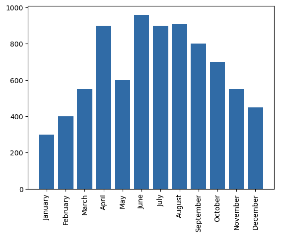
막대그래프
import calendar

print(calendar.month_name[1:13])
month_list = [1, 2, 3, 4, 5, 6, 7, 8, 9, 10, 11, 12]
sold_list = [300, 400, 550, 900, 600, 960, 900, 910, 800, 700, 550, 450]
캘린더 라이브러리를 통해서 달이름을 뽑아 내었습니다.
막대그래프를 그리기 위한 데이터도 만들어 주었습니다.
fig, ax = plt.subplots()
ax.bar(month_list, sold_list)
ax.set_xticks(month_list,calendar.month_name[1:13], rotation = 90) # ax.set_xticks(rotation = 90) 각도를 돌림
plt.show()
기본적인 구성은 선 그래프와 비슷하게 들어갔지만
ax.bar()를 통해서 그래프를 나타네고, xy축의 항목을 ax.set_xticks()를 통해 나타낸걸 알 수 있습니다.
rotation = 90을 통해서 글자들이 잘 보이도록 배치해주었습니다.
막대위에 각각의 값을 숫자로 표기하고 싶은데요.
import calendar


month_list = [1, 2, 3, 4, 5, 6, 7, 8, 9, 10, 11, 12]
sold_list = [300, 400, 550, 900, 600, 960, 900, 910, 800, 700, 550, 450]

fig, ax = plt.subplots()
barcharts = ax.bar(month_list, sold_list)
ax.set_xticks(month_list,calendar.month_name[1:13], rotation = 90) # ax.set_xticks(rotation = 90) 각도를 돌림

print(barcharts)

for rect in barcharts:
    #print(rect)# <BarContainer object of 12 artists> 나오는 이유는 artists를 다루는걸 알기위해 구체적인 수정을 접근하는 방식을 유도

    print(type(rect))#https://matplotlib.org/stable/api/_as_gen/matplotlib.patches.Rectangle.html
    height = rect.get_height()
    ax.text(rect.get_x() + rect.get_width()/2.,
    		1.002*height,'%d' %int(height),
            ha='center', va='bottom')


plt.show()
ax.text()라는 함수를 사용하여 표기가 가능합니다. 각각의 매개 변수들이 어떠한 역할을 하는지 챗GPT를 통해서 공부해 보았습니다.

'Data Science > Study 자료' 카테고리의 다른 글
| [pandas] 데이터 가로방향 통합 join()함수/ 인덱스 라벨 (0) | 2024.01.08 |
|---|---|
| [pandas] 데이터 통합 .append()오류해결 (0) | 2024.01.08 |
| 멀티캠퍼스2주차-4/ 파일 입출력 (0) | 2024.01.05 |
| 타이타닉/Titanic 텍스트 데이터 조작 (1) | 2024.01.05 |
| 데이터 추출 Test (2) | 2024.01.05 |