[시각화] seaborn, matplotlib다중차트 하나의 도화지에 담기
2024. 1. 8. 16:53ㆍData Science/Study 자료
import matplotlib.pyplot as plt
import seaborn as sns
import pandas as pd
import numpy as np
tips 데이터를 불러와 사용했습니다.
tips = sns.load_dataset("tips")
fig, ax = plt.subplots()
plt.show()
기본 그래프의 구성은 이렇게 되어있습니다.
fig, ax = plt.subplots(nrows = 1, ncols = 2)

plt.title('plt.title')

plt.show()
fig, ax = plt.subplots(nrows = 1, ncols = 2)
괄호안에 nrow,ncol로 그래프를 나눌수가 있습니다.
plt.title('plt.title')
각 그래프의 타이틀을 구성 할 수 있습니다.
fig, ax = plt.subplots(nrows = 1, ncols = 2)

ax[0].set_title('ax[0] title')
ax[0].plot([1,2,3])

ax[1].set_title('ax[1] title')
sns.scatterplot(x = 'total_bill', y = 'tip', hue = 'sex',ax = ax[1], data = tips)


fig.suptitle('plt.title') #타이틀 제목

plt.show()
fig, ax = plt.subplots(nrows = 1, ncols = 2)
ax[0].set_title('ax[0] title')
각 그래프의 타이틀을 정할수 있습니다.
ax[0].plot([1,2,3])
그래프를 그리는 툴
ax[1].set_title('ax[1] title')
각 그래프의 타이틀을 정할수 있습니다.
sns.scatterplot(x = 'total_bill', y = 'tip', hue = 'sex',ax = ax[1], data = tips)
그래프를 그리는 툴
주의 할건 괄호안에 x, y, data, ax값을 넣어야함
fig.suptitle('plt.title')
큰 타이틀 제목
plt.show()
더 많은 항목을 넣는 방법도 동일합니다.
배열의 원리와 같으며 원하는 위치와 그래프를 그리는 명령어괄호안에도 ax = ax[ , ]안에도 배열의 형식으로 들어가면 됩니다.
fig, ax = plt.subplots(nrows = 2, ncols = 2)

ax[0,0].set_title('ax[1] title')
ax[0,0].plot([1,2,3])

ax[0,1].set_title('ax[2] title')
sns.barplot(x = 'sex', y = 'tip', hue = 'sex',ax = ax[0,1], data = tips)

ax[1,0].set_title('ax[3] title')
sns.scatterplot(x = 'total_bill', y = 'tip', hue = 'day',ax = ax[1,0], data = tips) # ax넣어야함 주의

ax[1,1].set_title('ax[4] title')
sns.scatterplot(x = 'total_bill', y = 'tip', hue = 'sex',ax = ax[1,1], data = tips)


fig.suptitle('plt.title')
plt.tight_layout()
plt.show()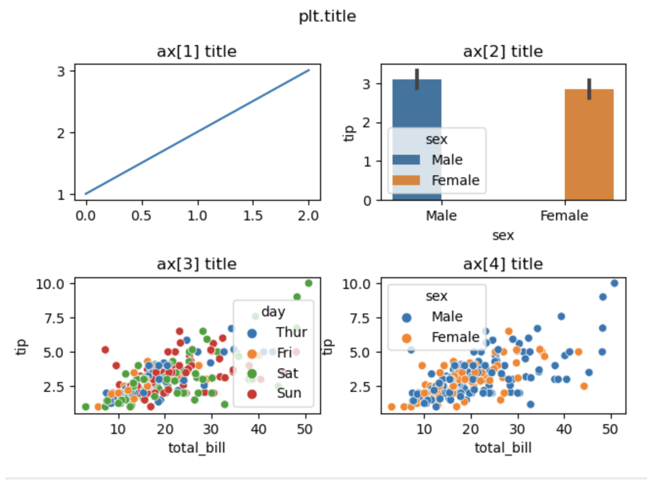
'Data Science > Study 자료' 카테고리의 다른 글
| [통계] 통계적 가설검정 (0) | 2024.01.11 |
|---|---|
| [pandas]데이터 파악하는 명령어/ 데이터 삭제 (0) | 2024.01.09 |
| [pandas] 데이터 불러오기 (엑셀,csv에 한글 포함) (2) | 2024.01.08 |
| [pandas]가로방향 데이터 통합 merge() 실무에 자주 쓸 느낌 (0) | 2024.01.08 |
| [pandas] 데이터 가로방향 통합 join()함수/ 인덱스 라벨 (0) | 2024.01.08 |